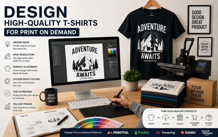
I uploaded my first print on demand t-shirt design back in a batch of twenty files, and eleven of them got rejected or came back looking like garbage on the actual shirt. Not because the designs were bad, exactly — because I didn’t understand what “print ready” actually means until a printer told me. So this is the stuff I wish someone had explained before I wasted a week re-uploading files.
Quick Answer
- Design at 4500x5400px minimum, 300 DPI, transparent PNG background
- Use vector files (SVG/AI) whenever the design has text or sharp lines — raster blurs on print
- Stick to CMYK-safe colors, not neon RGB values that look great on screen and muddy on fabric
- Leave safe margins (usually 1-2 inches from edges) so nothing gets cut off in the print area
- Avoid gradients and drop shadows unless your printer specifically supports them well
Why Print on Demand T-Shirt Designs Fail
Most rejected designs aren’t ugly. They’re technically wrong in ways that don’t show up until you’re staring at a preview mockup wondering why the colors look washed out.
Resolution is the big one. A design that looks crisp on a 13-inch laptop screen at 72 DPI turns into a blurry mess at actual print size. Screens and printers use resolution differently, and 72 DPI web images just don’t have enough pixel data to scale up cleanly.
Color space mismatches are the second cause, and honestly the one that confused me the most for a while. RGB is what your monitor displays. Printers work in CMYK. So that vibrant electric blue you picked? It might print as a flat, slightly gray blue because CMYK physically can’t reproduce every RGB value. Some platforms convert automatically, some don’t, and that inconsistency alone causes a chunk of the color complaints I see in POD forums.
Third cause, and this one’s sneaky: file format. Uploading a JPG with a white background instead of a transparent PNG means your “design” prints as a big white rectangle on the shirt. It’s a rookie mistake but it happens constantly, even to people who’ve been doing this for months.
And there’s a fourth cause that doesn’t get talked about enough — text that’s too thin or too small. Fine serif fonts or 6pt copyright text look fine digitally but either disappear or clog up into an unreadable blob once printed on fabric, especially with direct-to-garment printing.
Print on Demand Platform Differences
| Platform | File Requirements | Print Method | Common Rejection Reason |
|---|---|---|---|
| Merch by Amazon | PNG, transparent, min 4500x5400px | DTG | Low resolution, trademark flags |
| Redbubble | PNG/JPG, RGB accepted | DTG, varies by product | Copyright/IP violations |
| Printful | PNG, 150-300 DPI recommended | DTG or embroidery mockup | Design outside safe print area |
| TeeSpring/Spring | PNG, transparent preferred | DTG | Color bleed near edges |
Not every platform enforces the same rules the same way, which is honestly annoying if you’re uploading the same design to multiple stores. Amazon is the strictest about resolution and trademark scanning. Redbubble is more lenient on file specs but aggressive about IP takedowns. So what passes on one site can bounce right back on another.
Step-by-Step: Building a Print-Ready T-Shirt Design
Step 1: Start your canvas at the right size. Set up your file at 4500×5400 pixels at 300 DPI from the very beginning. Don’t design small and try to upscale later — that’s where the blur comes from. If you’re working in Canva, use a custom size, not one of the presets, since most of the built-in templates default to low-res web dimensions.
Step 2: Use vector tools for text and line art. If any part of your design has text, logos, or clean geometric shapes, build it in Illustrator, Affinity Designer, or even free tools like Inkscape. Vector scales infinitely without quality loss. Raster tools like Photoshop are fine for illustrated or painterly designs, but not for typography-heavy work.
Step 3: Keep your background transparent. Export as PNG-24 with an alpha channel. Check it by dropping the file onto a colored background in a preview tool — if you see a white box around your design, it’s not actually transparent, it just looks white against your white workspace.
Step 4: Respect the safe zone. Most platforms have a printable area that’s smaller than the full canvas, with a margin around the edges. Keep important elements — especially text — at least an inch or two inside that boundary. Designs that bleed too close to the edge sometimes get cropped unevenly depending on shirt size, since the print area scales differently on a small versus XXL shirt.
Step 5: Convert or preview your colors in CMYK. Even if the platform accepts RGB uploads, do a soft-proof conversion in your design software to CMYK before finalizing. It won’t be perfect, but it’ll catch the colors that are going to shift dramatically, like neon greens and hot pinks, before a customer complains.
Step 6: Test print before scaling up. Order one physical sample if the platform allows it. A screen preview is not the same as fabric, lighting, and actual ink absorption. This step feels slow when you want to publish twenty designs a day, but skipping it is how you end up with a storefront full of designs nobody realized looked bad until reviews started coming in.
What Actually Worked For Me
My first real fix wasn’t anything clever — it was embarrassingly simple. I kept getting soft, slightly fuzzy prints on text-based designs and spent two days messing with export settings, DPI sliders, sharpening filters in Photoshop, none of it helped much. Then a comment on a POD subreddit mentioned that text should basically always be vector, not rasterized, no matter how good your raster export settings are. I moved my text layers into Illustrator, rebuilt the same designs as vector paths, and the blur just… stopped. Felt a little dumb for not trying that first, but that’s how it goes sometimes.
That said, not every fix is that clean. I also had a batch of designs with a persistent color shift — blues printing duller than expected — and I never fully nailed down why. I tried recalibrating my monitor, adjusting the CMYK profile, switching export software. It got better, not perfect. From what I’ve seen, some of that gap between screen and shirt is just inherent to DTG printing and you learn to design around it rather than eliminate it entirely.
Advanced Fixes and Edge Cases
Embroidery digitizing is a different beast entirely. If you’re offering embroidered products, your flat design file doesn’t get “printed,” it gets converted into a stitch file, and small text or fine detail that works fine for DTG will turn into a blob of thread. Simplify designs specifically for embroidery SKUs instead of reusing your DTG file.
Trademark and IP scanning catches more than obvious logos. Amazon’s system in particular flags phrases that sound like they could be trademarked slogans, band names, or pop culture references, even ones you didn’t think were protected. If a design gets mysteriously rejected with no clear reason, run the exact wording through a trademark search before resubmitting.
Dark fabric vs. light fabric changes your file needs. Designs meant for black shirts usually need a white underbase layer, or certain elements need adjusted opacity, since ink behaves differently on dark fabric. A design that pops on white cotton can look muddy or washed out on navy or black without that adjustment.
Prevention Tips
Set your canvas size as a saved template so you’re never starting from a random low-res file. Keep a personal checklist — resolution, transparency, safe zone, color mode — and run through it before every upload, even when you’re in a rush. And build a small swatch library of colors you’ve already confirmed print well, so you’re not gambling on new hex codes every time.
FAQ
Do I need a print on demand design template? Not strictly, but it saves time. Starting from a correctly sized, correctly formatted template means you skip the resolution and transparency mistakes entirely.
Why does my design look fine on the mockup but bad on the actual shirt? Mockups are simulated renders, not the real print. They can’t fully show ink absorption, fabric texture, or CMYK shifts.
Can I use Canva for print on demand designs? Yes, but set a custom canvas at 4500x5400px and export as PNG. The free default templates are usually too low-res.
Is 300 DPI always required? Most platforms want it, but some accept lower if the file dimensions are big enough. Bigger pixel dimensions matter more than the DPI number alone.
Editor’s Opinion
honestly the design part is the fun bit, the file specs are the boring tax you pay to actually sell anything. i ignored resolution and color mode for way too long because it felt like a technicality, turns out it’s basically the whole game. do the boring setup once, save it as a template, and you’ll stop rejecting your own sales before a customer even sees the shirt.
